
Design is a very integral part of what we do here at TRIBUS, and creating initial concepts for our clients is difficult. You’ve got to consider your brand colors, voice, logo, advertising and the look and feel of your custom real estate brokerage website, among other things. And within your website, your have shapes, images, buttons, et al. Over time, the real challenge is maintaining it all, as industry trends and — more importantly — company objectives change. You need to be prepared for the these shifts, because it is a matter of when, rather than if, they will occur. One of the most helpful ways to be proactive about your design culture is to have a balance of real estate brokerage website design consistency.
This balance means that, whatever materials a person inside or outside your company encounters, they have a distinct style to them that can be easily identified as part of a broader ecosystem encompassing who and what you are as a company. Make no mistake, that is a hard concept to fully wrap your head around at times, and even harder to create. There’s no shortage of brands struggling with this, and you’ll arguably never be fully prepared for the task. But what you can at least desire to achieve is the most crucial element in this real estate brokerage website design consistency: balance.
Learn About Our New Ads and Leads Program - TRIBUS Engage
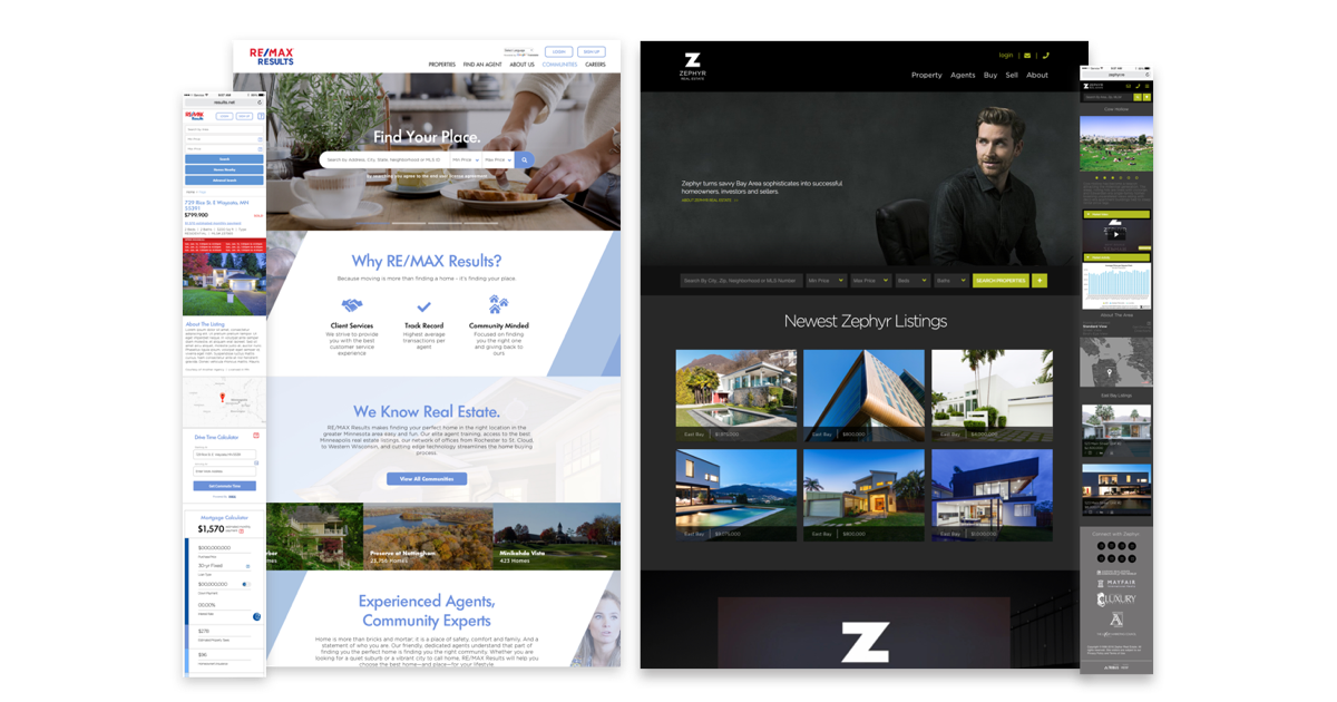
Above: examples of design consistency for two very different TRIBUS clients, RE/MAX Results and Zephyr Real Estate
Balance is a difficult thing to strike here, because making things too consistent invites monotony. On the other hand, being too careless about your real estate brokerage website design consistency could lead to unintended garishness, among other things. And, even worse on a practical level, you have to keep on tending to it, lacking rhyme or reason for your choices.
It’s really difficult to pinpoint how strict you should be with your real estate brokerage website design consistency, because you don’t want to hinder your creativity, but it most likely helps to identify where consistency is mostly non-negotiable.
Consistency is most crucial in areas of your website where users need to access information easily — its intuitiveness. Navigation is a strict use-case. Across all platforms, users need to know where to go and what they can navigate to, from a very recognizable area.
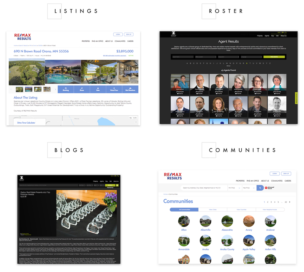
Above: various pages on our custom websites your visitors will be navigating through
Learn About Our New Ads and Leads Program - TRIBUS Engage
From a visual perspective, perhaps a blue button is seen on your website for the first time, which can set a precedent: not only can you expect an object of this size and shape repeatedly appearing in memorable spots, but also the specific color can allow you to identify other similarly colored elements to signify actionable events (like scheduling a showing or saving a search) to interact with if they choose to do so. In the end, it’s about users being able to make their own decisions about how they want to interact with your site — and be able to recognize how to do so quickly, on their own — that makes real estate brokerage website design consistency so valuable.
If a lot of this sounds familiar, it’s because I’m describing our own site, which you probably navigated through, and noticed some form of consistent design patterns. And whether it be through our site or through another’s, the intent is to give you familiar objects that build a hierarchy in your mind that, when seen enough times, users can then know what to expect and digest anything and everything on your site with relative ease.
Copy is another area of consistency. Always reference your products by the same names, and what you call your users and the actions they perform should all have a consistent level of coherence that is easily identifiable, no matter where they are in the process of consuming content. And, along these lines, tone is important as well. If you have a serious brand that exudes a serious tone, don’t all of sudden be playful for no reason (other than an occasional occurrence, like a holiday).
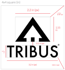
Above: an excerpt from TRIBUS’ brand guidelines
Regardless of how you approach your real estate brokerage website design consistency, it is absolutely essential that you document it. A style guide is incredibly invaluable, as it allows for anyone relevant to access all the assets that make up the design of your company. This way, questions about what buttons look like and how images are used become asked less and less frequently. You can find a simplified version of ours here.