
RE/MAX Results is our latest custom real estate brokerage site launch and, all around, we were very excited to launch last month and very proud of the work we accomplished with the creative team in Minnesota. You can find the final product at results.net and I’ll unpack the process of designing brokerage websites here.
The Kickoff for Designing Brokerage Websites:
A lot of our design goals revolved around a modern and enjoyable experience. To help define what is “modern and enjoyable,” RE/MAX Results introduced us to user data from interviews they had taken and what those words meant to the people who would ultimately be using the site. A lot of the information found revealed the importance of neighborhoods, school districts and the individual agent. These were a few places we wanted to focus on in design and craft elements that would aid in giving the user all the information they need for a great experience. Coupling the information with beautifully strong branding, we had a solid foundation to start designing real estate brokerage websites like this.

Learn About Our New Ads and Leads Program - TRIBUS Engage
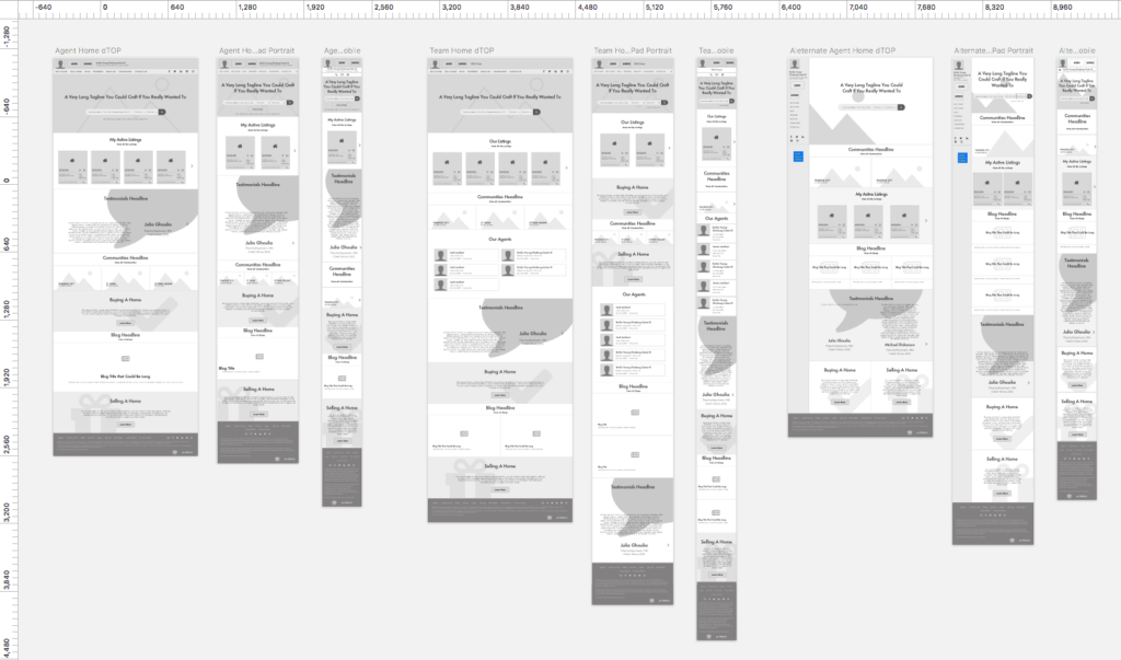
Wireframes:
As you’ll see in the initial wireframes below, you will notice there are very large elements throughout the layouts, even in greyscale. It helped fulfill our goal for a modern direction visually, as most modern websites use a lot of negative space. It gives you the ability to craft elegant layouts that highlight content well. It also aids in readability, which allows for content to be consumed more easily.
RE/MAX Results also set out to create flexible agent/team themes to complement the company website. It allowed agents and teams to express their personal brands and have more control over their layout options. This presents its own challenges, as you don’t want to create other sites that strike you immediately as the same, but Results had their finger on the pulse of their agents’ needs through their own in-house polls. We created a dark theme we wouldn’t initially have thought of without meeting about it.
The RE/MAX Results team did a great job investing a lot of time creating stunning imagery and content, which is invaluable and allowed us to be more prepared to create layouts with assets that they would already normally use. I’ve said it in blogs previous, but I don’t want to understate how important having the assets to build out a site truly is. Essentially, it saves us a lot of time during the process of designing brokerage websites and aids in bringing the whole creative team in one direction.
Learn About Our New Ads and Leads Program - TRIBUS Engage
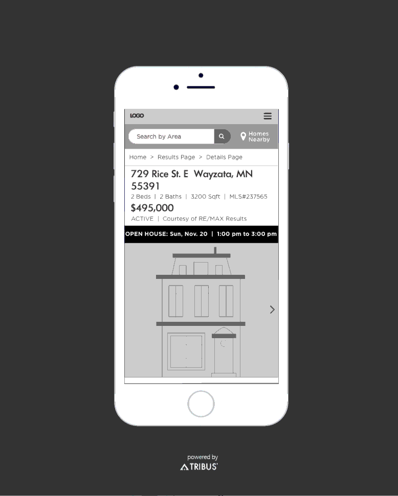
This is also the time we would start discussing animations and interactions. One of the talking points we had was the ability to interact with individual listings — what actionable buttons would be at a user’s disposal? Below, you’ll find some of the animations we did, which starts putting you in the mind of a user and what would help them the most while viewing a listing. We had many conversations like this about features and very small details that added up to meeting our goal of fun, simple browsing.
Hi-Fidelity Visuals:
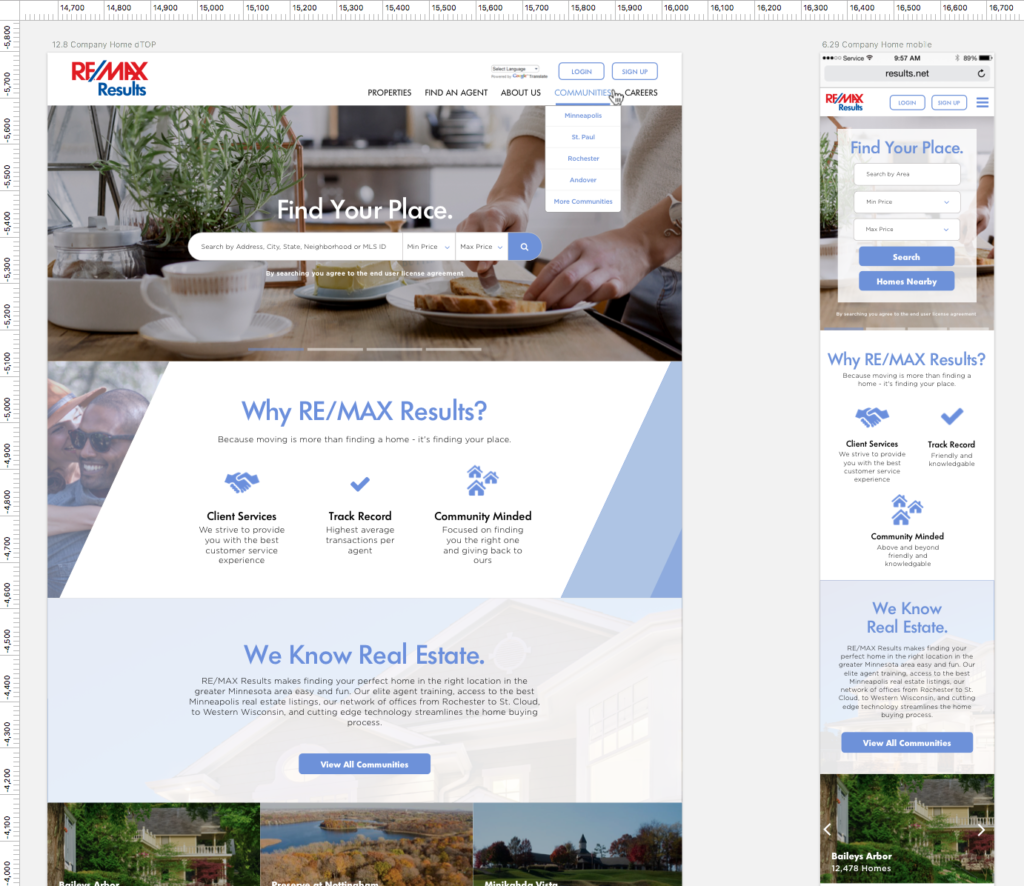
As is always the case, we start out with the home page first. We carried on the themes of large negative space — highlighting grays, blues and diagonal space — from their branding. The images are big and bold, but still approachable which match their messaging and extends into their search experience.
Learn About Our New Ads and Leads Program - TRIBUS Engage
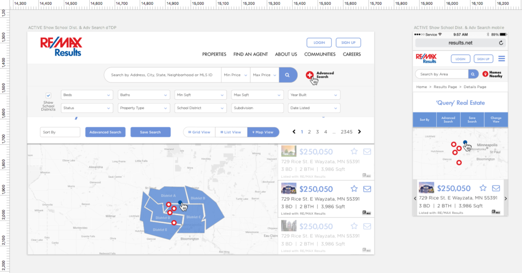
The map search was another important browsing experience to tackle. We wanted it to feel familiar and natural. It should give you a great deal of context and options, like searching within school districts. And hopefully, you get a sense of it being a reliable tool that encourages you to search more.
Fashion is never finished:
As I brought up in my last post, “fashion is never finished.” We’re only beginning to understand whether we’ve met the goals we set out to accomplish. We’ll monitor the site and user behavior over time. We’ll collect analytics, heatmaps, mouse tracking, and start building a story that tells us how the site is performing. And it will help us gain insights into improving in key areas, and help define the success of our design goals now and in the future. That’s because when you are designing brokerage websites, the process is never finished. If you haven’t checked out the site yet, go to results.net, and check out a few of our other projects here.