Interactivity is an incredibly useful tool in modern real estate brokerage website design when done correctly, but is it really necessary? The answer lies in grey areas, where on the one hand, no, it’s not entirely necessary — it just looks cool because it is cool. For effective design, we never strive to do something just to do it. But sometimes interactivity in your design enhances the user’s experience, imbuing your interface with deeper meaning simply by interacting with it. Motion can be effective in enhancing users’ understanding of the technology they’re using, which changes the way we, as designers, approach it.
It sounds a bit romanticized to say, but interactivity does tell more of a story than still pictures linked to one another. While pictures allow you to interpret them on face value, a moving story ebbs and flows, giving you a sense of relationships within elements in front of you. Let’s put interactivity into practice, using two of our own clients’ custom real estate brokerage websites: RE/MAX Results in Minnesota, who has a very clean, white aesthetic, and Zephyr in San Francisco, who has a contrasting, darker color scheme. They both have a very specific tone to them, the most obvious would be color. If you navigate through each of their sites, you’ll notice a change when you hover over a property:
Learn About Our New Ads and Leads Program - TRIBUS Engage
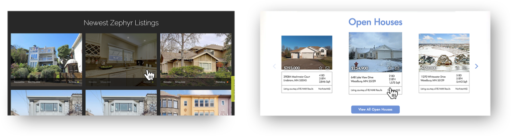
With Zephyr, a dark overlay appears. When you hover on the RE/MAX site, the listing subtly increases in size. So why did we pick one animation over the other? Because it made sense to create continuity between the aesthetic tone of the site and what a user is trying to do within it — the relationship between the site’s tone and the user’s interaction with it. Would be people notice the properties getting larger on a darker site like Zephyr’s? Would adding overlays to RE/MAX Results’ listings take away from the overall tone?
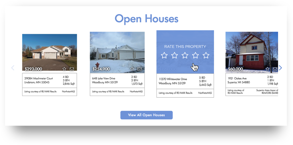
In the case of Results, overlay tones were an issue, and thus the slight increase in size was an appropriate measure to take, based on the given context and expectation of a clean site with tons of negative space. But it didn’t mean we left the option off the table. It was an even deeper issue, as there were other interactions happening within each listing, like rating the property. Simply hovering over a property implies a sense of spontaneous exploration — you don’t need a gaudy animation that breaks up the natural flow of scrolling through the website there. In the case of rating a property, there is a much more specific type of intent at play here. Users are only going to rate a property if they are actively trying to find the right home for them. In this context, you want to narrow down the user’s list of options by bringing their sole attention to one spot. This can be a very difficult thing to do, and thus, we added a brand color overlay. The result, which you can see below, breaks the otherwise clean tone of the site in order to focus attention on the interaction at hand.
And that is just a small taste of the many conversations we have here at TRIBUS about interactivity. There are a litany of more complex UX problems we aim to solve, linking to several other facets of the overall experience we plan ahead for. The whole point is, when done right, users leave with a sense of purpose and accomplishment with every interaction they make, regardless of how subtle they seem to be on the surface.