About 65% of people in the world are visual learners. Our world is built around visual cues, and we do judge books by their covers, even if we don’t want to. Our office here in Chicago is surrounded by skyscrapers with lettering on the side and billboards that advertise with imagery and typography. These skyscrapers appear breathtaking and awe-inspiring. But why do executives have large windowed offices near the top of the building? Surely you would want an office closer to the lower middle, where you can still have privacy from the street and a shorter exit out of the building. But obviously, for us in the real estate industry, it’s all about the optics — they can be literally gargantuan up high, closer to the penthouse. It feels more royal being high up, overlooking a breathtaking view. It makes for an infinitely better first impression, which is massively important, especially in real estate.
Your real estate brokerage website is no different. Recent studies from Zillow and NAR show that modern buyers will look online first. Your homepage should give off the best first impression, right when people open the page, and entice them to browse more. Do you know what first impression you are giving off?
The Power of a First Impression
The always excellent UX collective at the Nielson Norman Group put together an article on your online first impression, uncovering that this crucial first visit completely influences perception, relevance, credibility and usability. People have the ability to involuntary process certain patterns so fast that our perception has already formed before we’re consciously aware of it. Once we are aware and able to focus more — when we feel like we are in control over our decisions — our involuntary sense has already shaped our next actions.
Learn About Our New Ads and Leads Program - TRIBUS Engage
During the design phase of our building our custom real estate brokerage websites, we here at TRIBUS are thinking deeply about how to shape that initial perception. When users decide to start browsing, if we’ve done our job right, they’ve already had the cognitive conditioning needed for your brokerage to communicate that you’re credible and reliable.
How to Achieve a Good First Impression
It all starts with the aesthetics. In the Nielsen Norman Group’s study, it is proven that “users will tend to remember the site as more usable than it actually was.” Further, “a decision on aesthetics is made as early as 50 milliseconds in listing a site.” Your aesthetics will aid in the initial perception of your website’s effectiveness, while your UX will hammer home the point. Stay within a simple color scheme and font choices. Don’t overload the page with too much copy and don’t ask the user to do too much too soon within your copy. Allow the elements on the page to have ample space to signify their importance, and choose imagery that is relevant to the brokerage and your audience.
I’ve gone in depth about the power of this very specific imagery in an earlier post, but it doesn’t end there. There are amazing things being done with video — it can be a very dynamic way of showing multiple images and personality. Essentially, whichever route you want to go down, you want to convey a cohesive story that speaks to your audience, which you can read about more here. Our own client, Zephyr Real Estate of San Francisco, has beautiful market report videos that balance animation with visual data. They strike a great balance between on-brand imagery with video that conveys a story through data, which is becoming increasingly important these days. Here’s one for the town of Kentfield, covering the month of June:
Learn About Our New Ads and Leads Program - TRIBUS Engage
On your real estate brokerage website, tons of data flows through it. The most obvious slice in this kind of data is properties, another very visual element that can contribute to your credibility and relevance. Placing a conveniently functional search box can allow users’ minds to easily find properties, on top of cementing the idea that you have a very usable and useful site. The concept of the search box could be the subject of another article on its own. In short, its ability to auto-fill searchable options goes a long way in aiding the perception of your brokerage’s competence. Our own client, RE/MAX Results, has a website that exemplifies this.
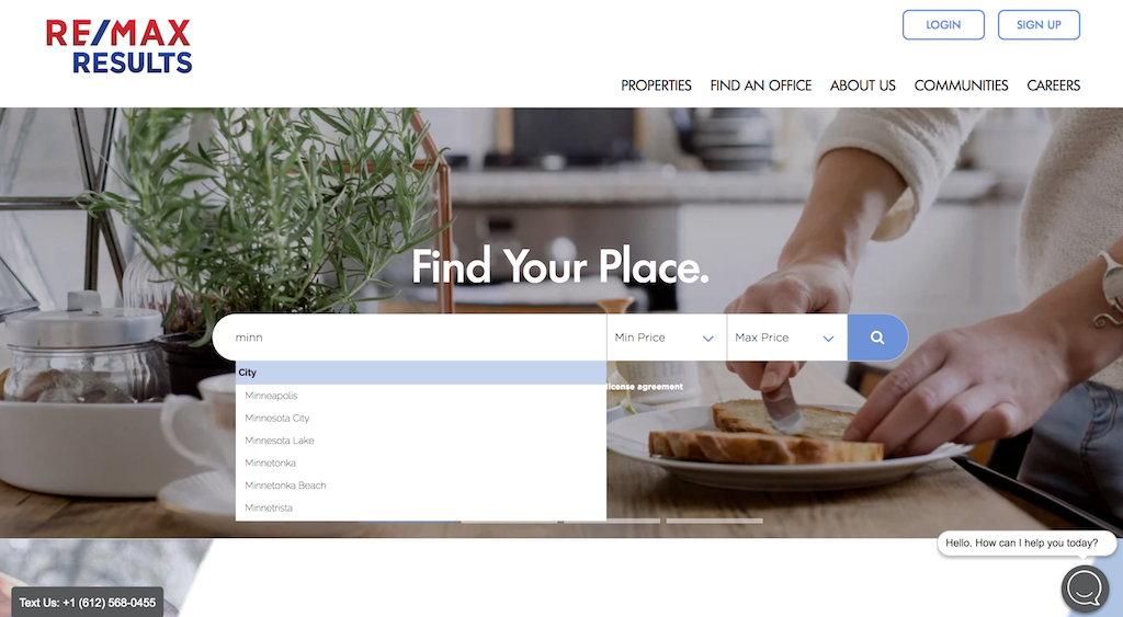
Along with an inviting tagline and a homey vibe to their imagery, this fully custom real estate brokerage website pulls you into their search box, allowing you to quickly find what you’re looking for, and anything else that is relevant to your search.
This only scratches the surface of what makes up an inviting and charming home page. And in truth, it’s difficult, because the only way it’s effective is if it’s specific to your brand and your audience. Done right, however, you’ll not only wow people visiting your page for the first time — you’ll also be placing the idea in their head to make a return visit. The first impression builds your company up to be a credible resource in their next search, and even their sphere of influence’s next search.
Now that we’ve covered a little bit of what you should do to make a good first impression with your real estate brokerage website, you should study up on what choices make for a bad first impression. Download our free white paper, “Top Bad Ideas for Real Estate Websites,” here.