
Not to be confused with your brand or your logo, a visual language consists of a long list of assets and elements that should have a cohesive link to each other that complement your brand — but not necessarily be your brand. The first step is identifying all the places (website, business cards and billboards, just to name a few) you can/will influence with this design language. It then allows you to have constraints that will focus your set of designs and promote consistency in your messaging and allows others working on assets, who are not otherwise familiar with your style, the ability to carry on the standard your team will set. Let’s dive into some of the larger aspects that apply no matter what assets your real estate brokerage has or how large it is.
Building a Consistent Color Palette
A color palette is certainly part of brand building and visual language: A singular, powerful component that gives users a cue that they are immersed within a certain brokerage and its personality.
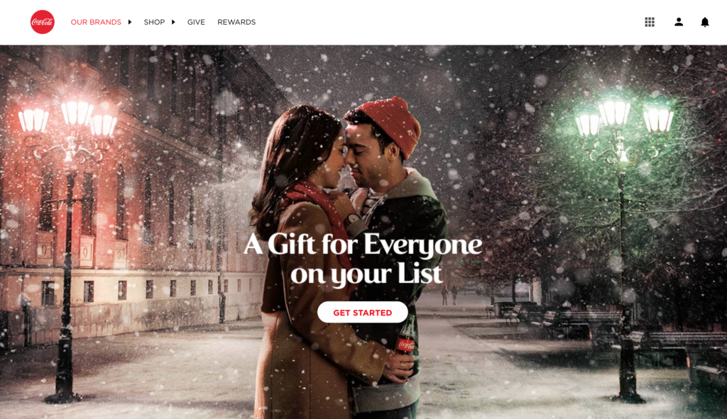
If you have a bold primary color, there are numerous ways to effectively assert its presence. Take Coca-Cola and Target, two red brands that choose to use their color in different ways on their websites. Coke takes a minimal approach. It’s an iconic brand that most people are familiar with, and they don’t feel the need to plaster the color all over the place. They let the emotion of their imagery and the physical product take center stage.
Learn About Our New Ads and Leads Program - TRIBUS Engage
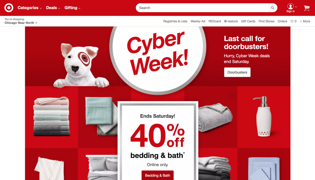
Target, on the other hand, also iconic, takes a much more bold approach as part of their visual language. They use simple patterns of red to exert the visual brand influence. And notice that, just because they have a bold color, it doesn’t mean they just plaster it everywhere flatly. They use different shades of red, use it as a checkerboard or circle to keep your mind interested in the content around the page, mixed with other imagery.
Making Type Memorable (and Readable)
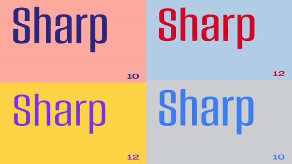
There is no escaping the amount of content associated with your brand, and no matter how minimal or complicated your brand is, you’ll have to convey some literal message. How people read it (in capital letters, large/small text, spaced out, colored in, etc.) is incredibly important. Creating a hierarchy of type families, sizes and placements will not only show off that brand personality, but more importantly, make the page easier to perceive. For instance, Dropbox recently went through a redesign, and a custom typeface they use in a variety of ways (seen below) was a central element they used to build their new visual language, along with strong color palettes.
Learn About Our New Ads and Leads Program - TRIBUS Engage
Choose a Direct Theme and Style for Your Imagery
This includes videos and illustration. But the consistency isn’t just always using humans or clear photos, which certainly are important, but more so: Do you use up-close, detailed shots? Do you want to portray a specific emotion within your assets? Are there colors that your could filter over them? The fine folks over at Climb Real Estate exemplify this. They use big, bright, local imagery that complements the clean look of their website.
Create a Library of Common Assets
Traditionally in the web development world, this would refer to having buttons, shapes and even animations that you could implement across devices, but I would take it a step further. This means creating things like icons and photography that will look good on any device, print material and beyond. The aforementioned colors and type could also be a part of this shared library, but the difference would be all the different ways you can implement these items in conjunction with specific elements that pair with them. Such as color in icons, or type within buttons.
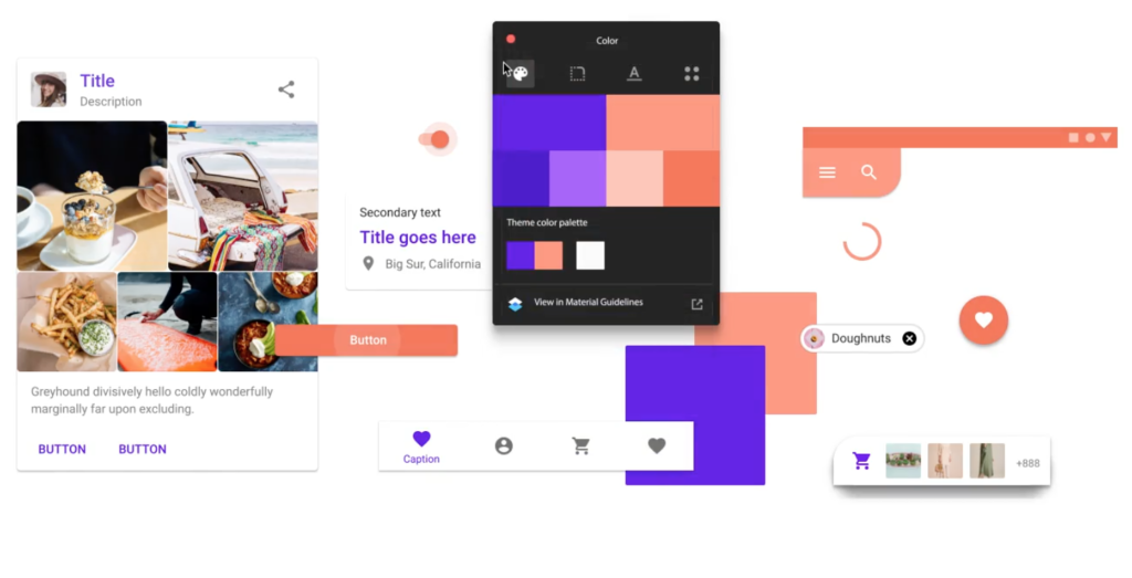
This library might be a more generic, wide-reaching document, such as a style guide (a term you’ll hear thrown around in tech all the time), as all things don’t fit all mediums. Keeping that range of examples will focus your team when you have to elaborate your visual language in the future. As you can imagine, a company the size of Google has excellent documentation on how to build exactly this type of document. And because they are so massive, they not only show you what their guidelines entail, but how to implement their Material Design philosophy on your own products.
Learn About Our New Ads and Leads Program - TRIBUS Engage
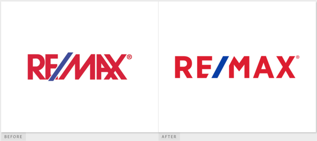
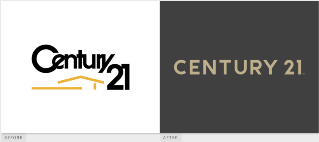
Examples of Visual Language Evolution in Real Estate
RE/MAX and Century 21 were the latest companies to give their languages a high-profile refresh, and regardless of how you feel about the changes, they both have done a good job of keeping a consistent system, made up of the points I’ve outlined and applicable across all their platforms.
It’s a big job, but it goes a long way in making the visual personality of your company stand out in a unified, iconic way. And one of the last important parts to building your visual infrastructure is to keep in mind that it is a living document. It should be built to evolve over time and mature as the design atmosphere and technology amongst us does.
Have fun and check out how we applied visual languages of other companies, including RE/MAX Results, here.