In my last post, Behind the Design Curtain, I discussed our design process here at TRIBUS. I’ll reference that method while walking you through the making of TRIBUS’ new logo design.
Before we can do that, we need to reference the body of work the executive team did establishing TRIBUS’s mission and values.
The mission states that we deliver “custom platforms to help brokerages best engage with their clients, agents and staff”.
TRIBUS’ Values:
- Engagement First
- Think Big Picture
- Welcome the Challenge
- Pave Our Own Path
- Be Grateful
The mission and vision are the platform of “why”, which guides the decisions the design department (and any other department for that matter) will make. It helps build consistency with our assets/deliverables and makes the brand stronger, which Erin Love details in her post.
Think about some of the biggest companies in the world. Companies you see on a daily basis and by in large, you can easily recall their brand mark because very good logos are instantly recognizable and appear to be simple.
The “appear” part is very important because you take a look at some logos and you might think “I could have done that. That must have taken all of 5 minutes.”
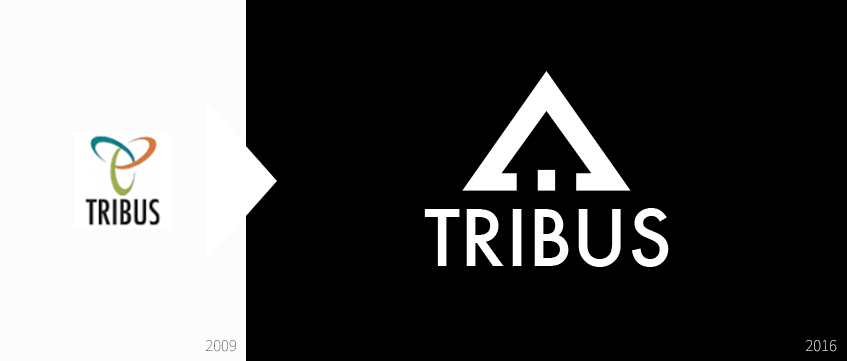
If you’re guessing that’s how we redesigned TRIBUS’ new logo, it certainly didn’t take 5 minutes, and neither did the rest of the great ones you know and can easily describe from memory. We had a lot of work ahead of us.
Learn About Our New Ads and Leads Program - TRIBUS Engage
The design team’s first task was to audit the current brand and logo design.
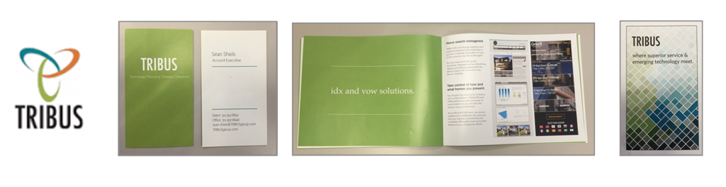
We had some good things such as strong type, solidified color palette, but the brand consistency was difficult to maintain. It was difficult to build upon going forward and most importantly, we had trouble relating the mark to our values.
Our goal was to create a brand and logo design that:
- Represents our mission and vision in real estate
- Long-lasting and easily recognizable
- Versatile across all mediums
With goals set, we can then dive into our research. Among the countless areas you could examine, we define what represents real estate. We figure out how others do it, what makes something timeless and what is recognizable to our audience. How do other great brands represent themselves on multiple forms of media and what do we think works for us and what we feel comfortable with.
I’ve just paraphrased the work we did for the sake of time because it certainly is consuming and a luxury, but if you have the resources, it’s an invaluable piece that can reinforce the “right” design decisions and maybe even make you re-evaluate your goals in certain circumstances.
Learn About Our New Ads and Leads Program - TRIBUS Engage
Moving along, we get into a fun exploration phase with lots of sketching. Based on our research, the project designers naturally explored iconic house-like interpretations.
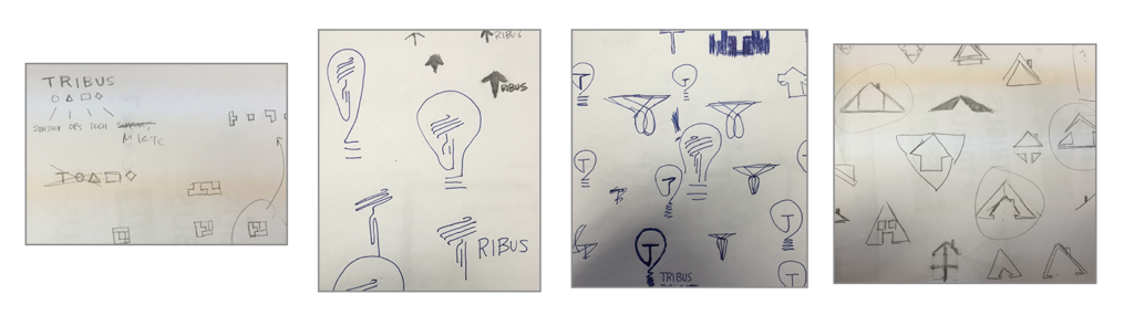
Based on initial sketches, without using a house outright, which takes many forms between detailed and simple, it’s becoming clearer that some triangular shape will hammer home our message the best.
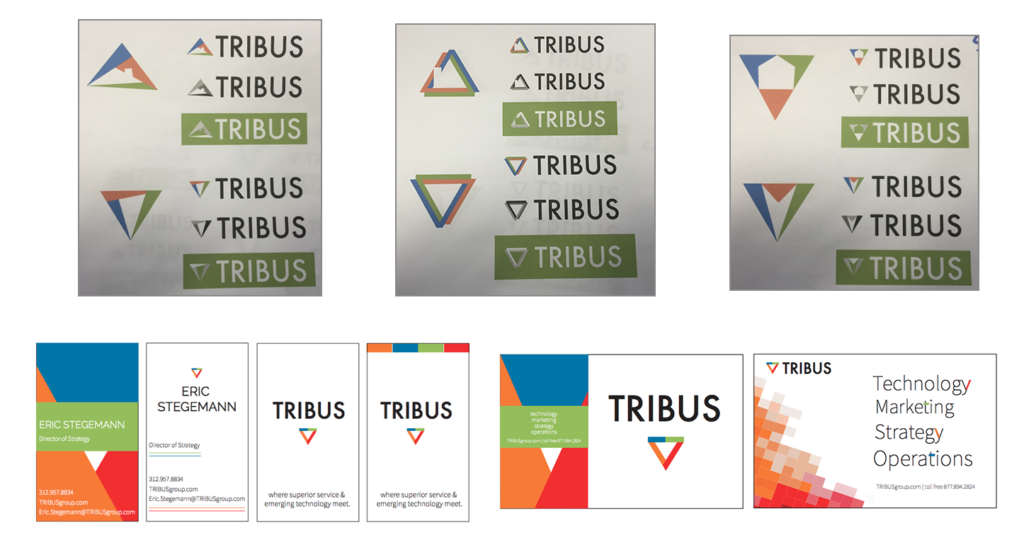
Next, we go higher fidelity and begin experimenting with typography and color more. We wanted to create something new yet still keep some elements from previous brand iterations, specifically the typography.
Learn About Our New Ads and Leads Program - TRIBUS Engage
Futura is a great readable font and as we applied it in our original form, the narrow font-style was out of place. We discovered that the other standard font-style was wider and matched a much wider, triangular mark that our team was committed to.
The team finally narrowed down the shapes and after some long discussions, we finally settled on TRIBUS’ new logo design: a traditional triangle with 2 holes in the bottom, giving the appearance of a house in the middle.
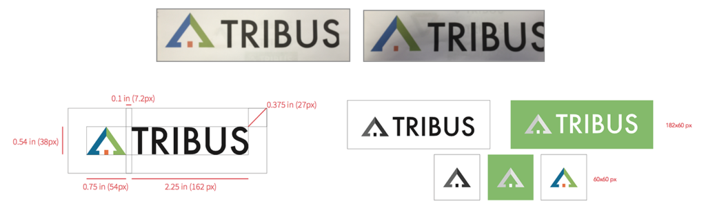
Reverting back to our goals, we were able to evaluate it:
Does it represent our mission/vision?
- Using color, the triangle appears split, which refers to our most important value, but forms a clear house that represents our industry well.
- It is clear and the house is evident enough that over the years, the interpretations of it would still be the same.
- Versatility is strong and still very legible when placed on colors, especially when the logo is reversed in white.
As pleased as we were with reaching our benchmarks, we had some more decisions to make, largely in part the color, which the team figured out was complicating the outcome. In the end, we went with solid black and white, selecting secondary brand colors independent of TRIBUS’ logo.
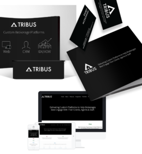
It resulted in much of what you’ve seen on the website: a clean black and white look that carries into our physical presence like you see here:
That was a lot more than 5 minutes, and there’s even more than what I’ve outlined here, but that’s more or less how TRIBUS’ new logo design was done.