Does your real estate brokerage platform provider have a team of User Experience designers and researchers? Do they go out in the field and learn about how people use your brokerage / agent websites? Do they ask your agents what’s working and what’s not?
The team at TRIBUS does.
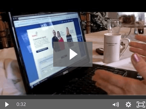
These are the things we’re intrigued at testing everyday. We not only use in person samplings, but we also do what is called A/B testing. Meaning we present one display of a website to some users, and a different one to others. We check user engagement, time on site and many other factors with each and then make a decision about what to do after coupling the A/B testing with the video we have of interactions in person. We want to share some videos of user interaction on the site so you have an idea as to what we do, and why you should consider it when building your next site. Much of the video will feature user interaction on some major websites. Redfin is one of them. (By the way Redfin, we do a ton of testing on your sites. Why might you ask? Well the truth is that while millions of users check out Redfin each month, FEW actually use them for their agents which makes their site a GREAT case study. After studying many markets, especially Southern California and Chicago, I can’t tell you how many users answer the question: What site do you look for real estate on? Redfin)
Topic 1: Too Many Choices
While in general most people would say they love choices, displaying too many on a website can become daunting. Sometimes, even the simplest duplication of choice can confuse a user.
Did you notice what happened here? The user was frustrated enough by seeing both the search box and the word “BUY” as a button that she was verbally irritated. Most interestingly, she actually avoided using the primary search box in the hopes that she would find what she was looking for by clicking the BUY button.
We anticipate that this user behavior is due to a few different things but first and foremost, it’s related to choice. By giving the user what she perceived as two click choices for the same thing, she became irritated and ended up choosing the lesser of two options. (In a later video we’ll show the frustrations she had once clicking the BUY button.)
Lesson on Web Usability:
When creating your site, keep in mind that you should make it extra clear what each potential click or interaction on your site does. Instead of BUY perhaps Redfin should have used the word Info on Buying, and left the search box on the main page to do it’s job. Consider, what on your site might be confusing like this to a user who wouldn’t know anything about real estate?