
Logo. Navigation. A large “hero” image. Listings. Agents. Social media. Communities. Blogs. These are a number of prominent elements that you will find on your real estate brokerage website. And they could be small, they can also be very big, but there is no doubt they are all important and we make it a point of focusing in on all of them within the website design process at TRIBUS. It’s our responsibility, along with our clients, to ensure that these elements exist to inform your audience of who you are, what you do and how you do it. And although they are all necessary, it’s not necessary to see them all at once. That’s why we encourage minimalism.
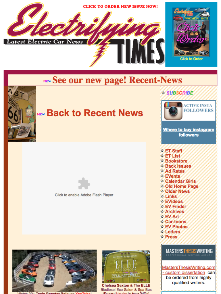
Even if you could pack everything all on your page and get most of it above the browser fold, you can’t read everything at the same time and any attempt to would be a waste and the potential loss of a user. Try doing this with Electrifying Times’ site, which is a news site about electronic cars. It’s 2017 and this is still a thing:
Learn About Our New Ads and Leads Program - TRIBUS Engage
That is definitely an outlier even by bad website standards, but it illustrates the age of information overload and how it’s getting harder and harder to keep people’s attention. Bombarding their screens with more than what they could consume is a risk as, according to Adweek, you only have seconds to prove your worth to the consumer.
If you ask yourself, “What is the most important thing I could tell someone about my real estate business in a matter of seconds?” then surely you would find a way to show that when your homepage loads up for the first time. And you might be tempted to show a few more details and maybe keep them smaller in proportion to your most important message, but it’s this one idea that you should focus on, and map the rest of your site in a similar fashion. That is the digital world we should be living in, and its name is minimalism.
Minimalism in Website Design
Minimalism in the website space is a combination of liberal use of negative or “white” space (which doesn’t necessarily mean it is the color white), along with your normal visual elements I named earlier, but in a more subtle manner. Contrast Electrifying Times with Domain Management Tools, Nuage’s marketing website.
Learn About Our New Ads and Leads Program - TRIBUS Engage
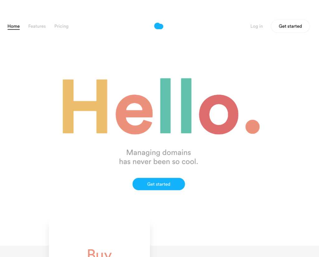
There isn’t really much of anything on the site at first glance, besides a nice warm greeting with a subtle animation over a white backdrop. It gives you a very concise message about its purpose and a clear button inviting you to take the next step. And if you’re not quite ready and need to learn more, you could scroll to find 3 more simple, informative boxes. This is the modern website of today: Clean, simple and minimal. Nuage uses an abundant amount of negative space that still provides you with 10 links’ worth of information that are subtle enough to play second fiddle to the main content of “hello” and, below what’s in the screenshot, three boxes. Kind of reminds me of a site you’re on right now.
Minimalism for Real Estate Websites
But, of course, real estate is a different animal altogether, and you can’t just put the words “real estate” in big bold letters on a white background. It might serve as a superior strategy for Electrifying Times, but for us in real estate, we need listings, agents and blogs. And the answer at TRIBUS, as I’ve harped on in many posts, is balance. If you take a look at some of our clients, we have designed structured content blocks that focus in on single ideas with secondary elements that supplement the overall theme of the block.
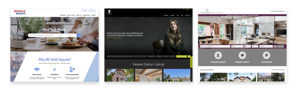
The first block is usually reserved for a property search. Branding is usually incorporated, as the search element by itself is quite small, despite its importance. But after we’ve allocated the space for it, we are on to the next content block, which can entail a whole host of options, and so on.
It seems so simple, because the space around interactive elements is easily overlooked, but finding the right way to incorporate it can have great benefits, including aiding in the relationships between content, organization, visual sophistication and readability. Quantitatively, using negative space well can arguably reduce your the amount of people that leave your site after viewing only one page, also known as bounce rate.
Your website is just like any living organism on the planet: It needs room to breathe.