There are so many different fascinating disciplines in design, but the one that always sticks out to me is typography. I remember sitting in one of my first design courses where I received an intro to all the different facets and I remember watching the documentary, Helvetica, and in it you can see people working, looking at their screens and manipulating the smallest corners of each individual letter.
And I thought to myself, “Hmm… that’s a silly job, why would I ever want to go into that?” And to this day, I don’t find it silly, but my attention span would never allow me to focus on a project such as that. Over the years I’ve learned to appreciate the subtly of it and love every part about it because it is important that someone create these beautiful pieces that many people take for granted.
Typography is everywhere because it’s the vessel to relate your message and depending on the typography you choose, it can make you look certain way and as I’ve already conveyed in numerous posts, your first impression is everything. And if it is everywhere, it’s important that you choose wisely. Thin font families can make your words look elegant, but it’s of no use if your particular audience can’t read it. Pick something too bold, you may have the same problem to a lesser degree, but you might come off looking childish.
Now I’ve never been a fan of lists, but I’m about to make one of my favorite fonts. Depending on your needs, it can directly narrow your selections, but in most cases there are tons of fonts for your needs and when it comes to our custom websites at TRIBUS, we use Google’s Font library that keeps your site lean. Here are my favorites:
Learn About Our New Ads and Leads Program - TRIBUS Engage
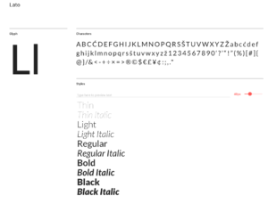
- Lato– This is one of my defaults, as well as many designers. As you will see, I choose versatile fonts in the sense that they have numerous ‘style’ or weights that allow that font to become very bold or very thin. And this one is always a safe pick to look very elegant, but readable.
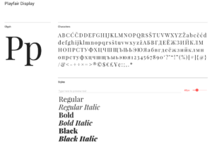
- Playfair– Serif Fonts are making a comeback lately and this is truly a classic one. They would remind you of older print publications as the legs at the bottom of the letters were intended to ease readability. It has this very “Vogue” like style that is timeless and comes off very “smart”.
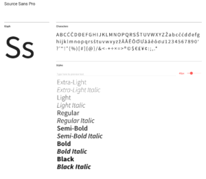
- Source Sans – The standard TRIBUS font for our content, not only is it very versatile from a weight standpoint, it complements our Futura font family which is very bold and blocky. We chose it for the versatility and its subtle roundness when we rebranded with a goal of coming off more approachable and friendly.
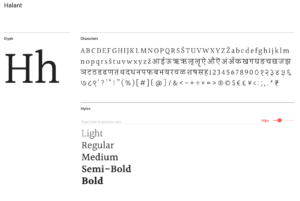
- Halant– Is another serif that I’ve been using recently as it has a gorgeous light font weight that Playfair lacks and looks a bit more modern as it is a bit more narrow than the ‘blockier’ classic looking Playfair.
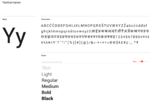
- Yantramanav– This is currently my flavor of the month as I like plain-looking fonts that have, again, many font weights. Not only possessing a fantastic name, it is a straightforward font, where almost all the traditional letters that you could curve at the bottom are straight. If you look closely the lowercase “t” is the only one to have a curve in it…but we can’t all be perfect.
Massimo Vignelli always said you only need 5 font families to design well, and although I didn’t pick any of his, I more or less agree with the principle. When you’re choosing font families for your project it’s always a good idea to have 2 that you can pair, usually a serif (the ones with legs at the base of letters) with a sans-serif (no legs). But no matter what you choose, make sure it’s a reflection of who you are and the message you want to convey.

